Terrible Things
Graduate School Project, 2019
I wanted to experiment with both relief printing and digital animation, and attempted to create a project that would combine the two. Inspired by Russian folklore and the concept of childhood memory, I first storyboarded an animation and then selected four frames that I thought I would be able to pull most of my animated assets from. Those frames were then revised, transferred to linoleum blocks, hand carved, and used to create relief prints. Once the prints were pulled I scanned them, digitized them, and used those digital assets to create the final animation in Adobe After Effects.
In addition to the four frames that I carved, I also created two small character studies that were printed in red and blue, then overprinted. I wanted to further tell the story, using the overprint to highlight a "transformation" between the sweet old lady in blue to the red witch.
Oracle Brewing Package Design
Student Work, 2018
Oracle Brewing is a fictional brewery I created for a 2018 package design class. Heavily inspired by paper cut illustration and mid-century aesthetics, I wanted to create a series of labels with a strong, visual identity that would stand out on a store shelf.
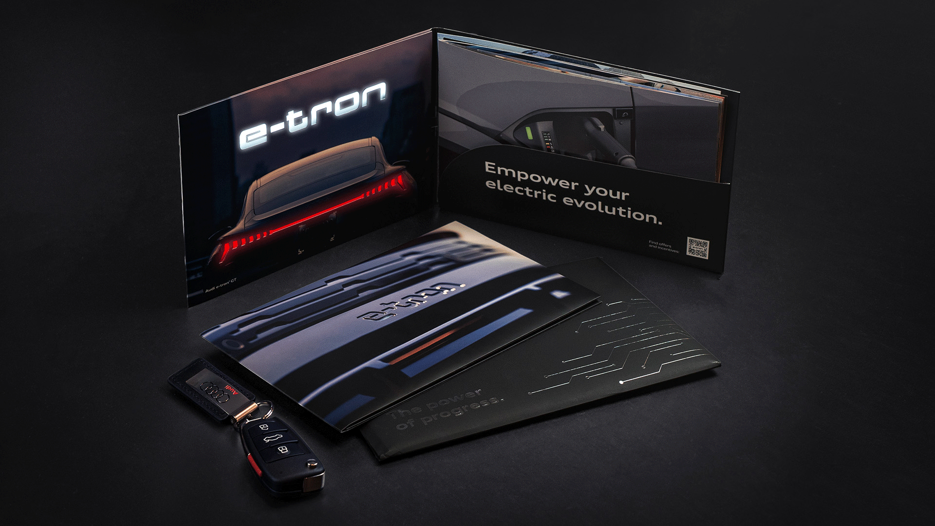
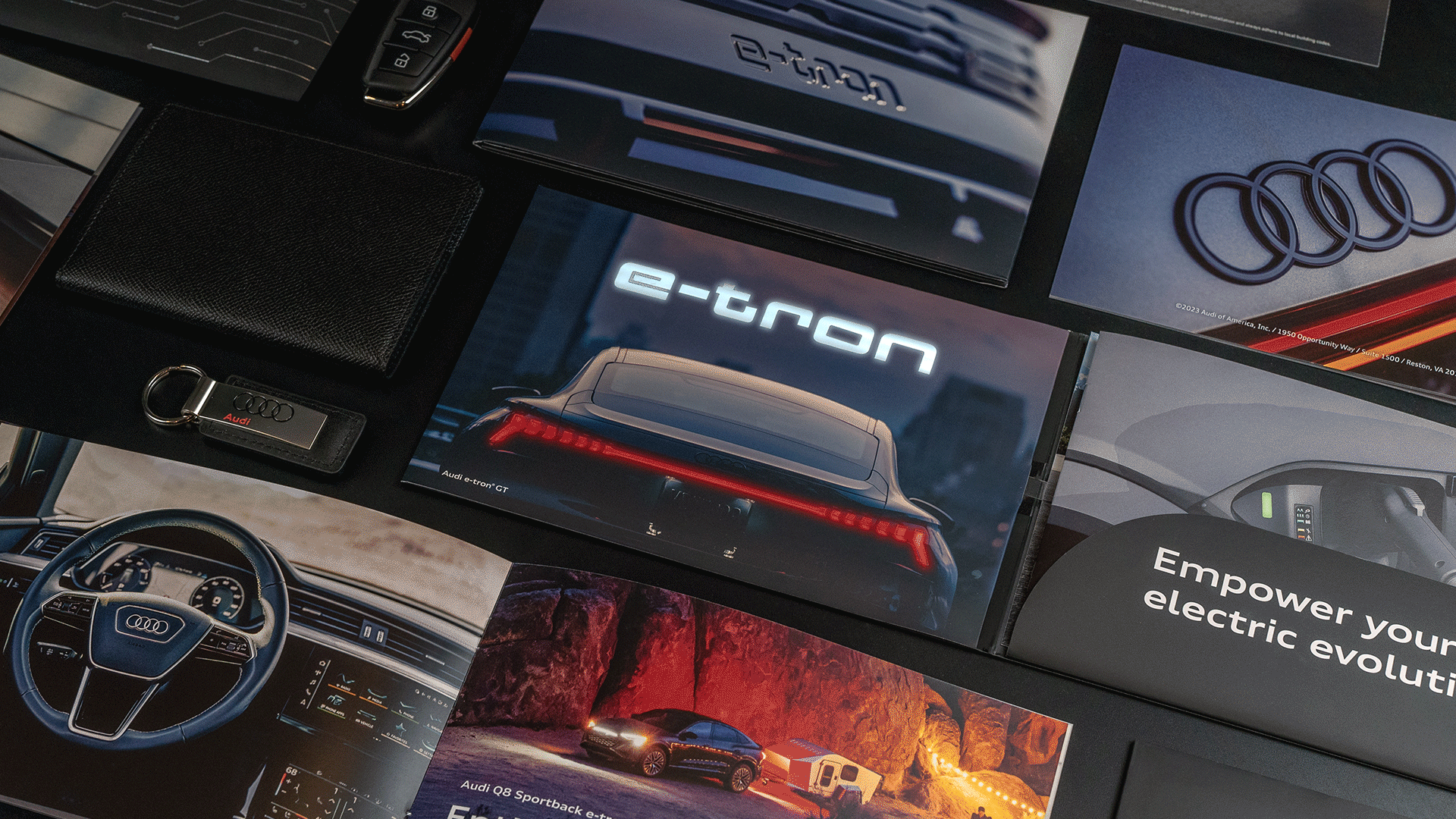
The Power of Electric
This fully custom mailer features the Audi e-tron fully electric line of vehicles. Open the mailer to see a beautiful de-boss that mimics the vehicle logo cut out. Unfold it further to be delighted by a light up message and accompanying booklet featuring the full Audi e-tron line.
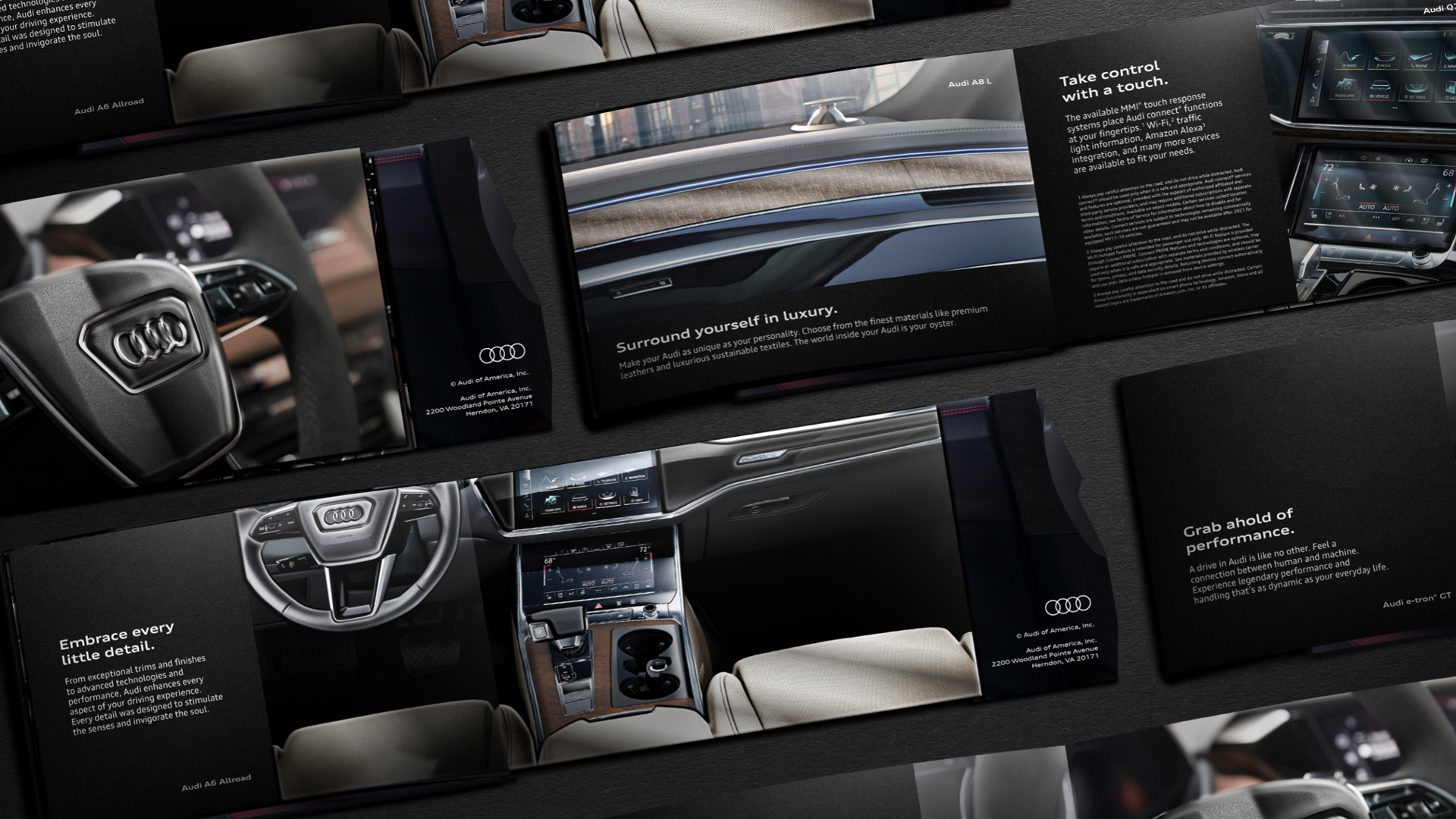
A8/S8 Executive Mailer
This direct mail piece was designed to be a luxury mailer - focusing on high end Audi models with a more focused, exclusive audience. Each side of the mailer highlighted a different model - the white side was the sophisticated A8, the black side was the sporty S8. These layouts mirrored the other, encouraging the user to flip the book to view the other model, and a center spread of the Audi rings on red connected the two. This 8.5 x 11 book was perfect bound and designed to feel like a high end coffee table book. A more editorial approach, as well as special coatings and printing techniques, were used throughout.
This project won a 2023 Bronze Regional Addy in the Atlanta market.
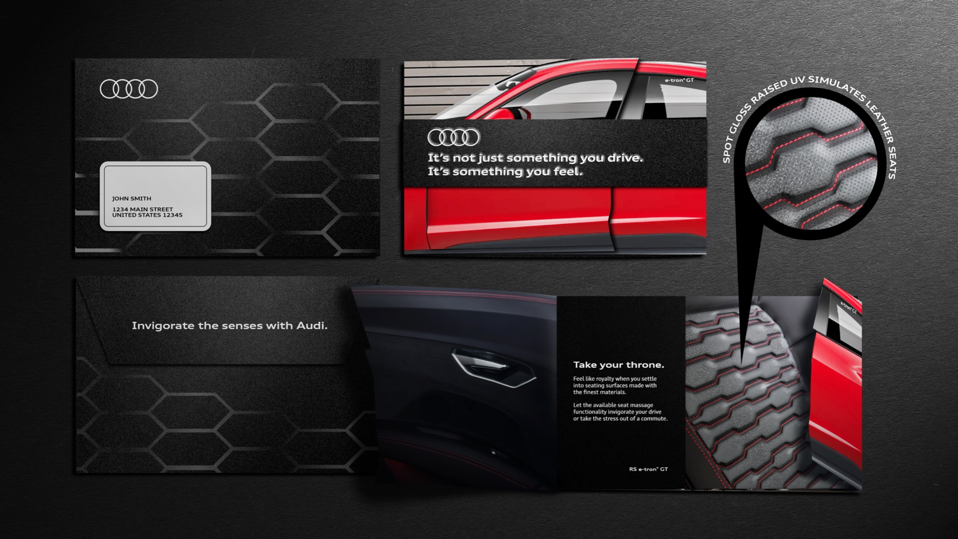
Experience Audi Mailer
Our client requested a direct mail piece that would allow recipients to experience the luxury and power of an Audi vehicle. We employed a variety of custom printing techniques to achieve this - raised UV glosses and textures to mimic screens and seat leather, black foil stamping on the envelope in the pattern of a vehicle grill, and a die-cut opening that makes you feel as though you're opening the door of a car. The final product was a multi-spread booklet that encouraged viewers to engage with the piece and discover more about Audi.