Terrible Things
Graduate School Project, 2019
I wanted to experiment with both relief printing and digital animation, and attempted to create a project that would combine the two. Inspired by Russian folklore and the concept of childhood memory, I first storyboarded an animation and then selected four frames that I thought I would be able to pull most of my animated assets from. Those frames were then revised, transferred to linoleum blocks, hand carved, and used to create relief prints. Once the prints were pulled I scanned them, digitized them, and used those digital assets to create the final animation in Adobe After Effects.
In addition to the four frames that I carved, I also created two small character studies that were printed in red and blue, then overprinted. I wanted to further tell the story, using the overprint to highlight a "transformation" between the sweet old lady in blue to the red witch.
Oracle Brewing Package Design
Student Work, 2018
Oracle Brewing is a fictional brewery I created for a 2018 package design class. Heavily inspired by paper cut illustration and mid-century aesthetics, I wanted to create a series of labels with a strong, visual identity that would stand out on a store shelf.
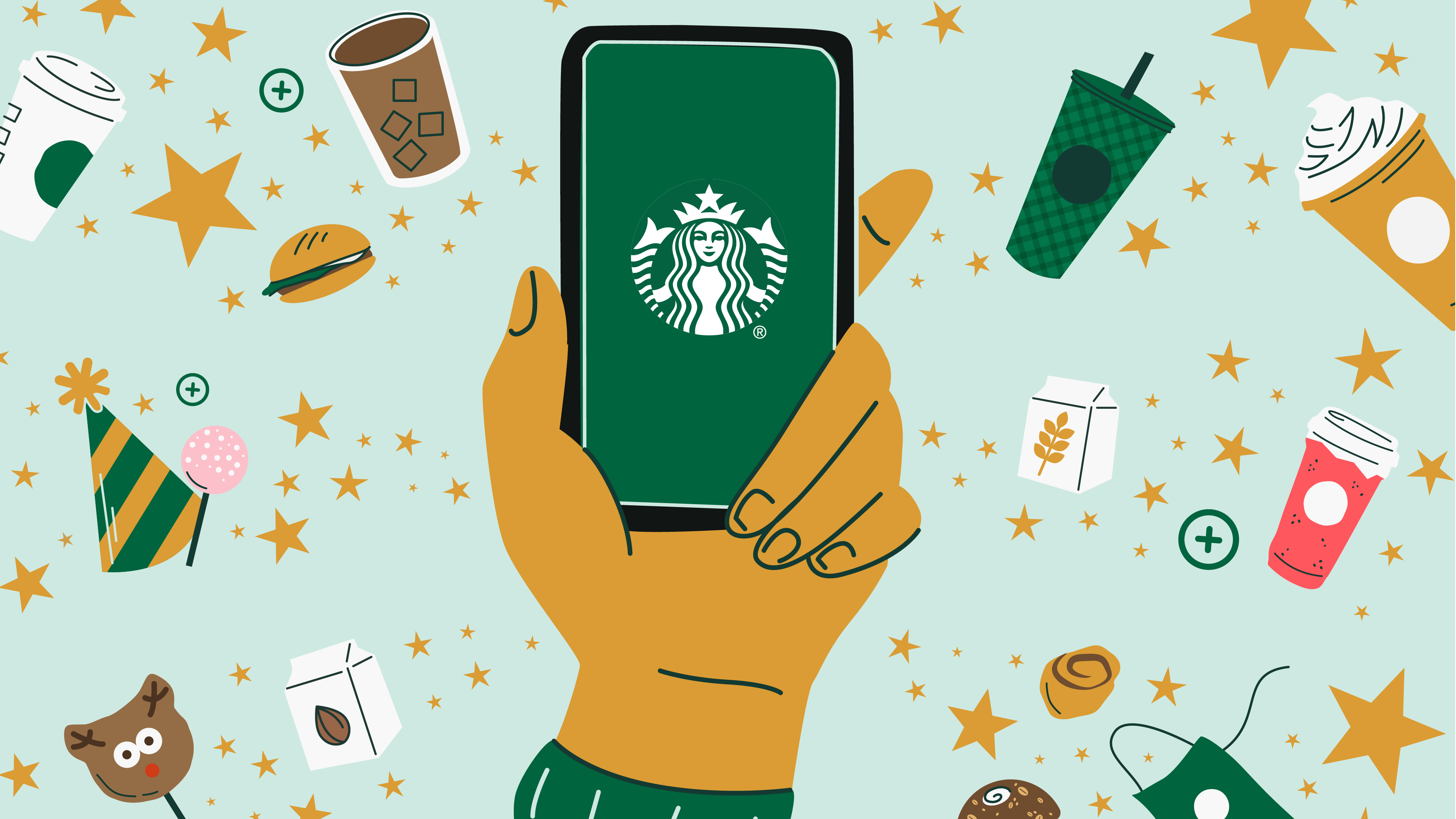
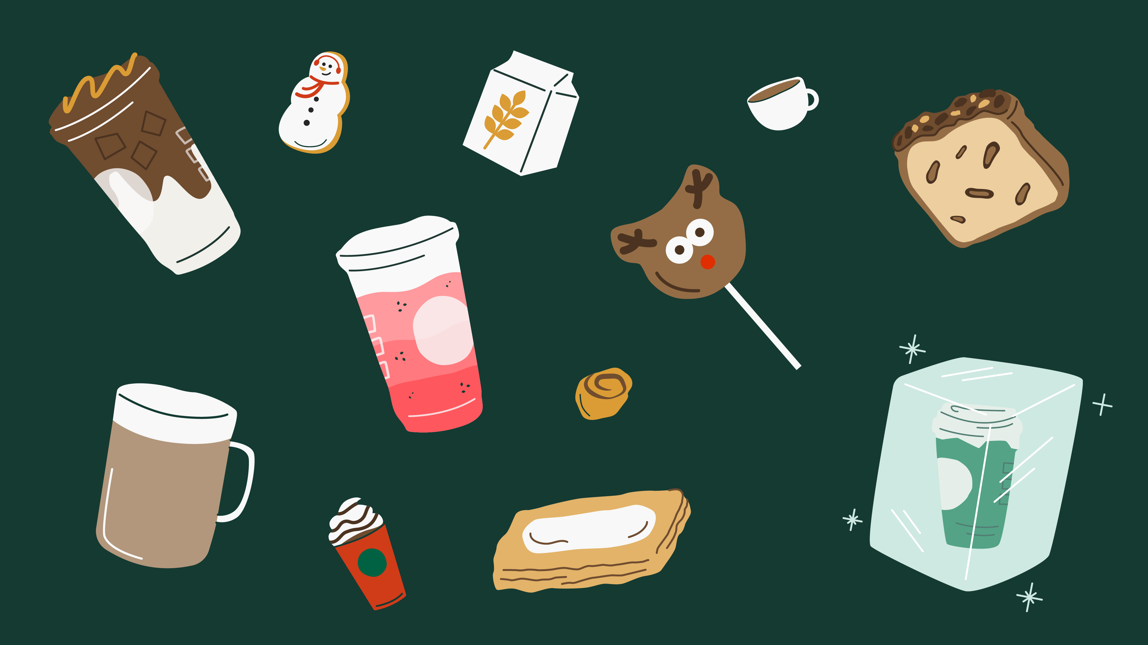
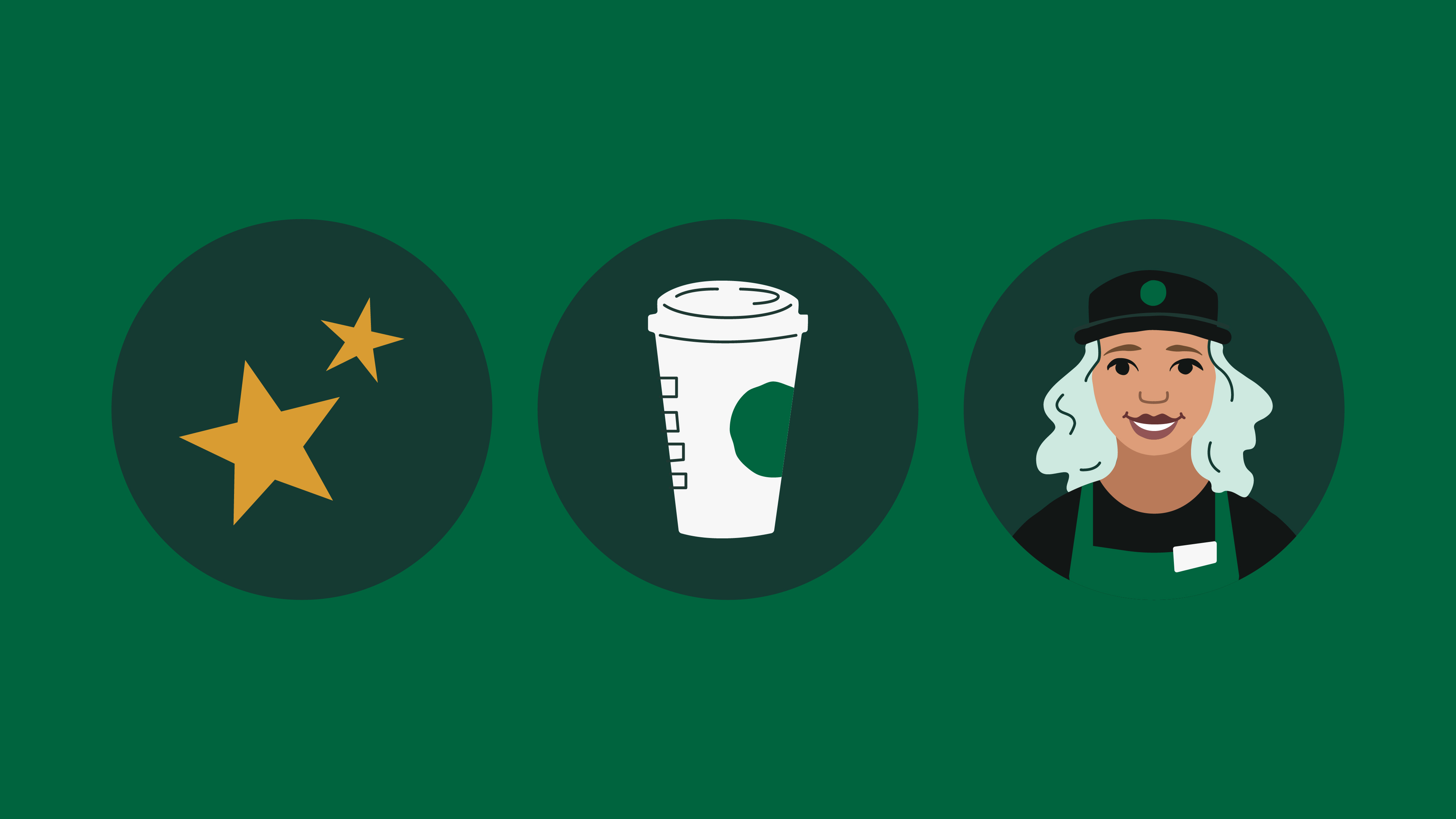
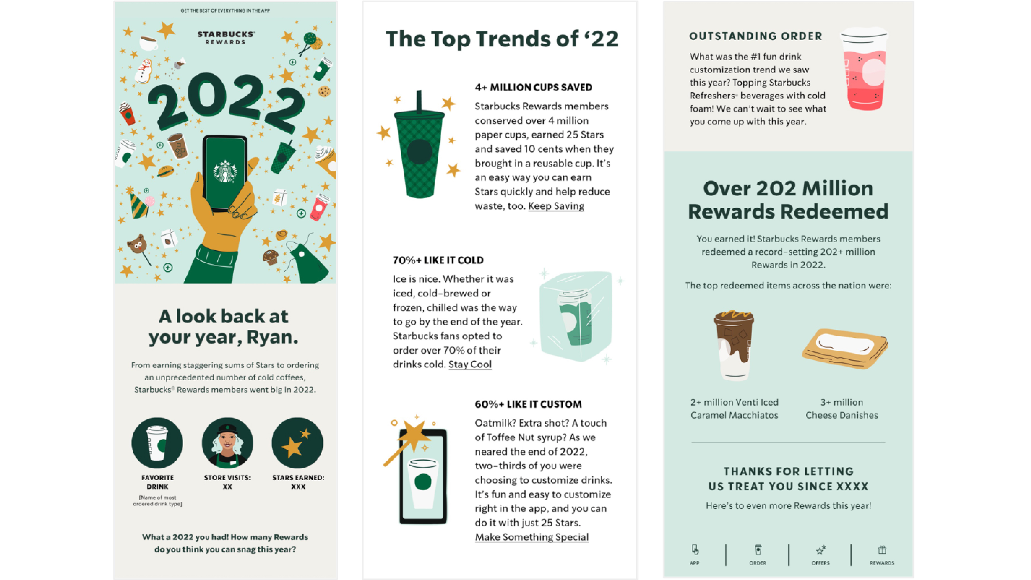
Starbucks Rewards Year in Review Illustrations
I was asked to work with the Starbucks team to develop a hero illustration as well as several spot illustrations for the 2022 Starbucks Rewards Year in Review email. This email was sent out to all Starbucks Rewards members, and featured a summary of their rewards history from the previous year. Working closely with our art director and graphic designer, I conceptualized and created a series of illustrations that captured both the distinct brand identity and celebratory, playful feel of the email.