Terrible Things
Graduate School Project, 2019
I wanted to experiment with both relief printing and digital animation, and attempted to create a project that would combine the two. Inspired by Russian folklore and the concept of childhood memory, I first storyboarded an animation and then selected four frames that I thought I would be able to pull most of my animated assets from. Those frames were then revised, transferred to linoleum blocks, hand carved, and used to create relief prints. Once the prints were pulled I scanned them, digitized them, and used those digital assets to create the final animation in Adobe After Effects.
In addition to the four frames that I carved, I also created two small character studies that were printed in red and blue, then overprinted. I wanted to further tell the story, using the overprint to highlight a "transformation" between the sweet old lady in blue to the red witch.
Oracle Brewing Package Design
Student Work, 2018
Oracle Brewing is a fictional brewery I created for a 2018 package design class. Heavily inspired by paper cut illustration and mid-century aesthetics, I wanted to create a series of labels with a strong, visual identity that would stand out on a store shelf.
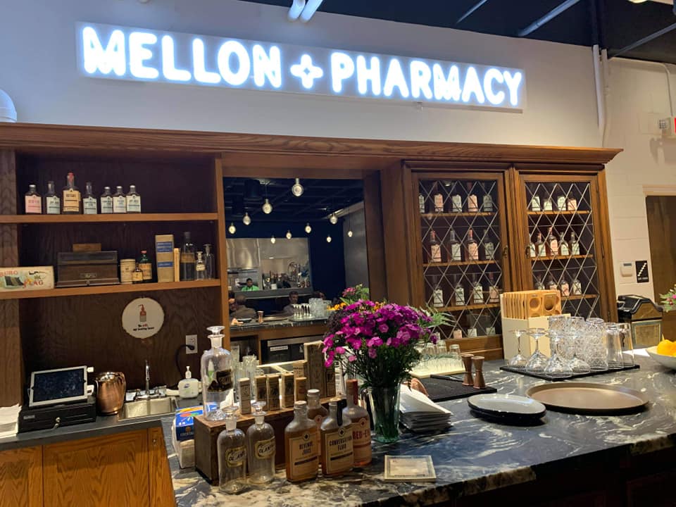
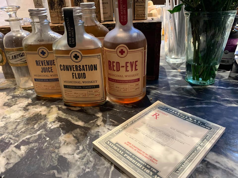
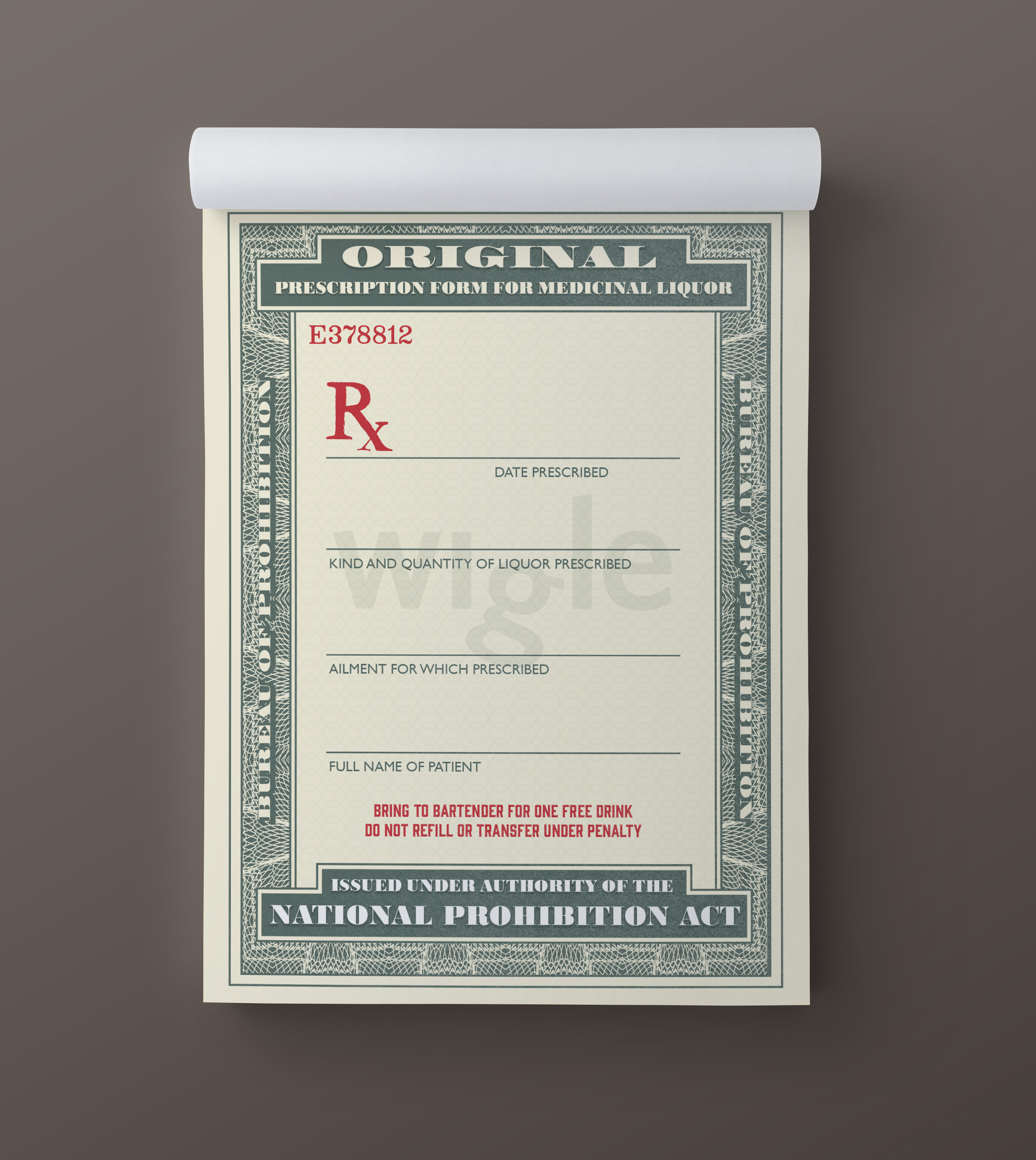
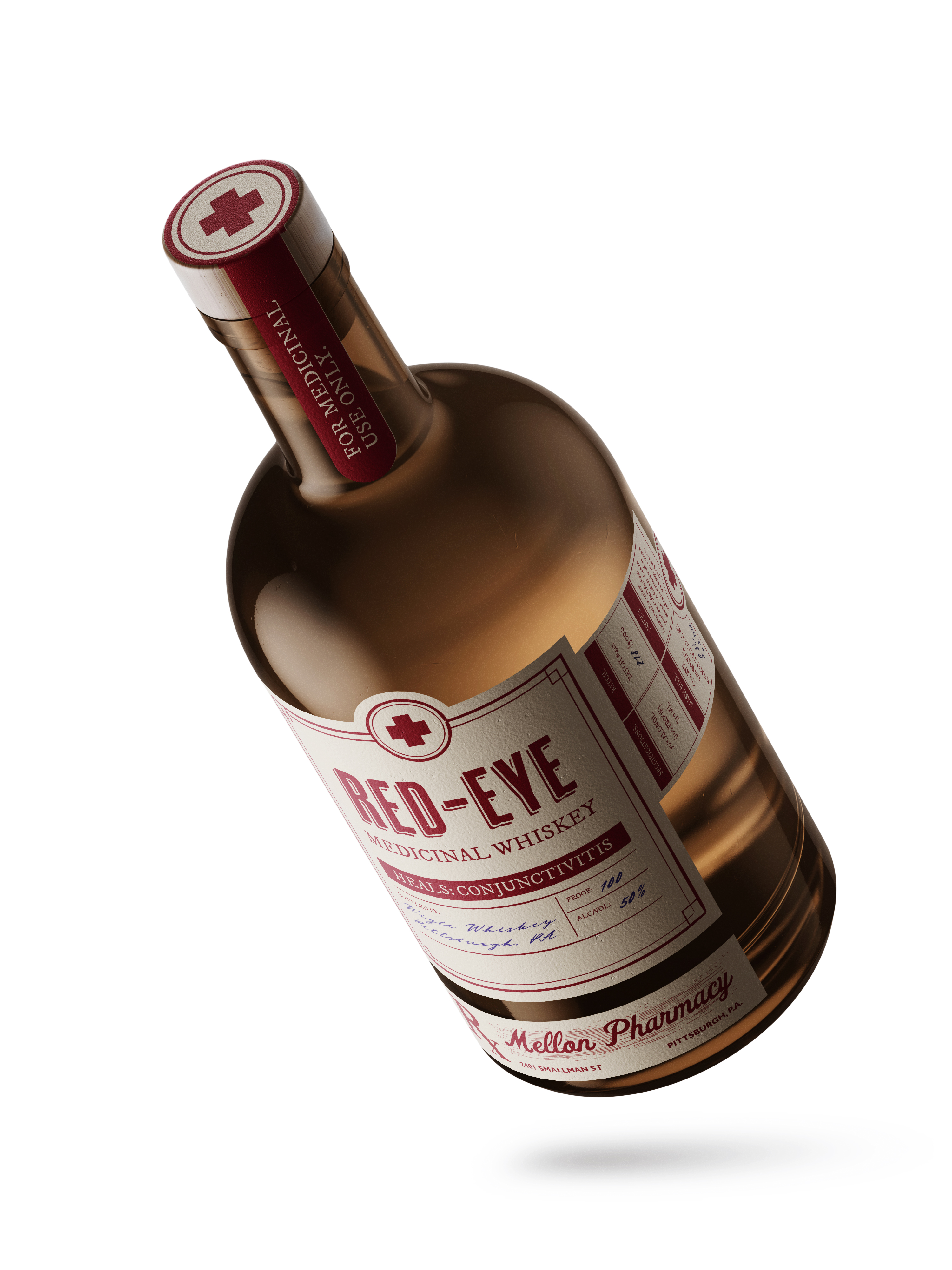
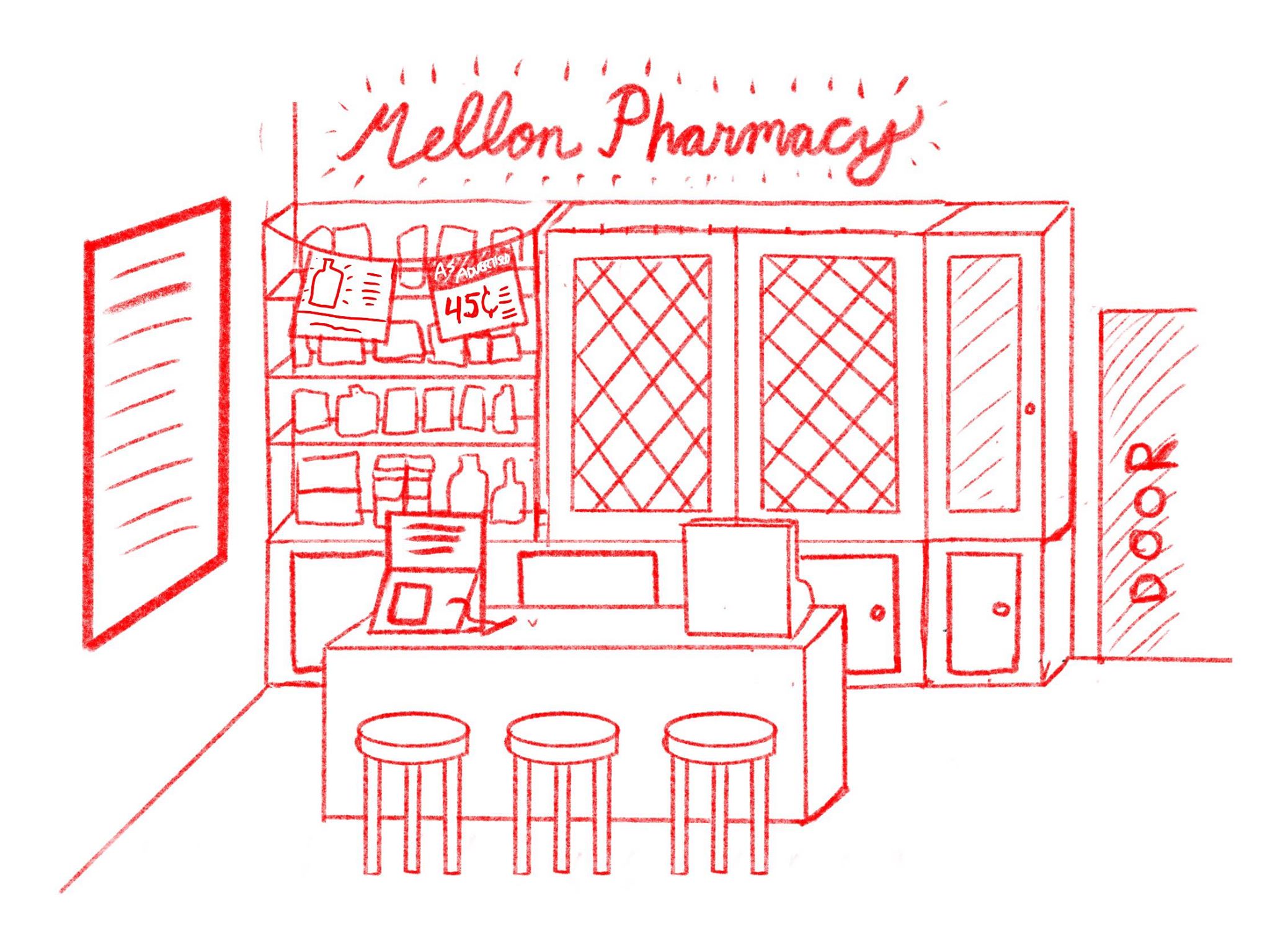
Mellon Pharmacy Design
In 2019 I worked with Wigle Whiskey to design one of the themed areas in the new event space at their Strip District location. I conceptualized and developed graphic design pieces for an area inspired by Andrew Mellon, medicinal whiskey, and the prohibition era. I designed several fake "medicinal whiskey" bottle labels as well as a "medicinal whiskey" prescription pad. The bottle labels were inspired by medicine bottle labels from the 1920's and 30's, and the prescription pad was influenced by historic medicinal whiskey prescription pads. The event space opened in late March 2020, and the prescription pads were adapted as postcards to be sent out with mobile whiskey orders during COVID-19.